Best Practices for Designing Mobile App Buttons
Key Takeaways
- Appropriate button sizing improves touch accuracy and comfort for all users.
- Consistent design allows users to quickly recognize and trust your interface.
- Visual and haptic feedback provide instant confirmation of user actions.
- Strategic button placement enhances one-handed use and overall accessibility.
- Color and contrast choices are vital for visibility and inclusive design.
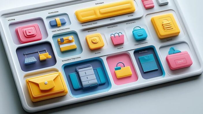
Designing effective buttons is one of the most important aspects of mobile app user experience. An intuitive button strategy helps users navigate smoothly, prevents frustration, and encourages engagement. Whether you are starting a new project or refining an existing app, focusing on the fundamentals of app button design will yield better results for both usability and accessibility.
Buttons act as the primary points of interaction within a mobile interface, guiding the user’s journey and prompting essential actions. Thoughtful design choices in terms of size, color, and placement can make your app feel more cohesive and inviting, creating habits that encourage users to return. Focusing on clear visual cues, thumb-friendly placement, and appropriate contrast not only benefits the majority but also ensures your app welcomes users of all abilities.
Taking a user-centered approach to mobile app button design also means thinking about context. Different devices, hand sizes, and accessibility needs require careful consideration and flexible solutions. For insights on adapting design choices for different platforms, Apple’s Human Interface Guidelines for Buttons offer comprehensive reference points that suit a wide range of modern use cases.
Optimal Button Sizing for Touch Interaction
The first step to effective mobile button design is ensuring that every button can be tapped easily and accurately. Research from leading usability experts suggests a touch target size of at least 44×44 pixels, which roughly matches the average fingertip. This sizing reduces the likelihood of accidental taps and ensures everyone, including users with reduced dexterity, can interact with the app comfortably. Oversized or undersized buttons can lead to frustration, so striking the right balance is essential for both usability and aesthetics. Well-designed touch areas are a foundational part of mobile accessibility and help set the tone for a pleasant user experience.
Consistency in Button Design
Uniformity in color, shape, typography, and feedback not only boosts usability but also strengthens your brand’s visual identity. When users encounter familiar visual cues and behaviors, their confidence increases, making the app feel predictable and efficient. Inconsistent button styles can increase cognitive load, causing hesitation and confusion. Simple guidelines like keeping similar actions similarly designed and using a limited palette of styles across the entire application reinforce clarity. Frequent testing and referencing design systems, such as Google’s Material Design principles, can help maintain this consistency.
Providing Clear Visual Feedback
For users to feel in control, your buttons must provide instant visual, auditory, or tactile feedback on interaction. Button states such as default, pressed, disabled, or loading should be clearly distinguished by color changes, subtle animations, or vibrations. This immediate feedback reassures users that their taps have registered and sets expectations for what comes next. Clear feedback can prevent double-tapping errors and support a more engaging, responsive interaction pattern, key to building trust and satisfaction.
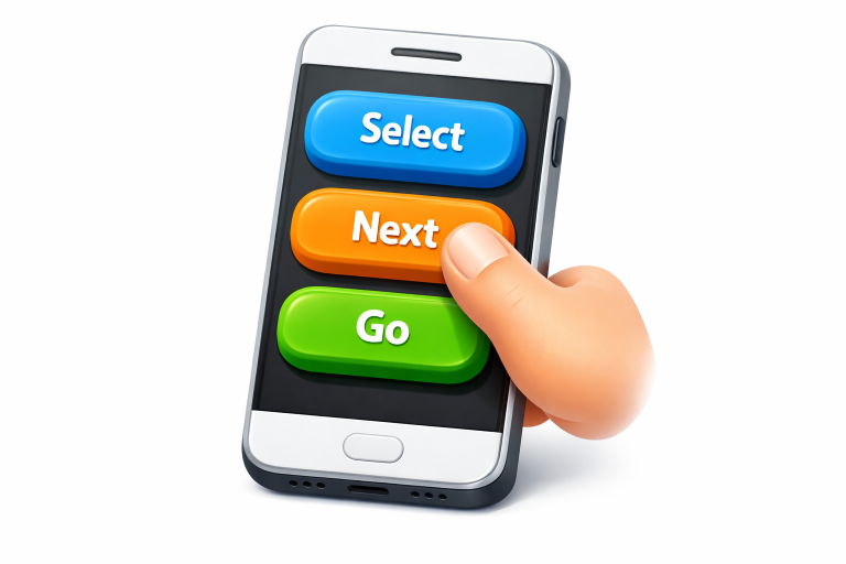
Strategic Button Placement
Smartphones are designed for one-handed use, which means designers must pay careful attention to thumb reach zones. Placing frequently used buttons, like primary actions, within the lower half or bottom corners of the screen aligns with natural grip patterns. This approach minimizes strain and enables users to interact comfortably, even on large devices. Placing secondary or less frequently used actions outside these prime locations can also help prevent accidental taps and streamline navigation.
Utilizing Color and Contrast Effectively
Strategic use of color and contrast makes buttons noticeable and accessible to a wide range of users, including those with visual impairments. Primary buttons should use a prominent color that stands out from the background and other UI elements, while secondary actions might utilize muted tones or outlines. High contrast ratios are crucial not just for general visibility but also for compliance with accessibility standards. Designers should test their color schemes for different viewing conditions and use established color contrast tools to ensure readability.
Minimizing Clutter Around Buttons
Adequate spacing around each button not only improves tap accuracy but also gives the interface a clean, organized appearance. Crowded layouts can overwhelm users, increasing the risk of mistakes and reducing satisfaction. White space is valuable real estate in mobile design and should be included generously to draw attention to key actions and simplify the path to task completion. Proper separation between interactive elements reduces cognitive load and increases user confidence in navigating the app.
Ensuring Accessibility in Button Design
Accessibility is not just a checklist but a commitment to designing for everyone. Buttons should be easy to find, readable, and operable by users with varying vision, dexterity, or cognitive abilities. In addition to touch target size and high contrast, designers should support keyboard navigation, screen reader labels, and logical order for all interactive elements. Adhering to guidelines set forth by organizations like the Web Content Accessibility Guidelines (WCAG) is essential for building inclusive mobile experiences.
Conclusion
Thoughtful mobile app button design is one of the most effective ways to increase engagement, satisfaction, and overall usability. By striking the right balance between size, consistency, feedback, placement, color, and spacing, and by making accessibility central to the process, you help guarantee a more intuitive experience for every user. Quality button design is never an afterthought but an investment in an app’s long-term success and reputation.
- How to Prepare Your Home for a Successful Sale: The Essential Steps
- Understanding Cash Home Buying in Detroit, Michigan: A Comprehensive Guide
- Exploring Homeownership in Columbus, GA: A Comprehensive Guide
- The Benefits of Selling Your House Quickly During Sudden Life Changes
- How to Start Practicing Tai Chi at Home: A Complete Beginner’s Guide